Responsive, accessible, and mobile-friendly website design are standards requirement that can influence search engines page rank and more; they are not passing trend that will fade away with time.
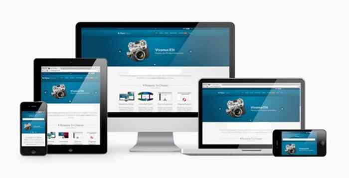
Multi Device Web Design
Given the rapid advancement of the world wide web and the emergence of new exciting electronic devices like tablets, Ipads, and Smart phones, web design has a whole new meaning and a lot of challenges to overcome. Thanks to Css flexbox and grid technologies, developers can address the multi-device design challenges.

Work On All Browsers
Multi-device web design is a unique concept used by Standard Web Designs to create inter-operable websites that render on any digital device with a web browser and connected to the web.
It simplify the process of designing for mobile phones and other electronic devices with different screen sizes, including Television. Did you know TV can render web pages too? A web browser is an application software that allows people to find and view information published on the world wide web.
What is Multi-Device Web Design? It's a unique coding technique that merges essential principles of responsive web design with Css grid and flex box components to create a scalable website architecture.